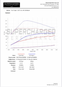
What does a dyno graph show & how do we read it?
Our Vtech Dyno (dyno) graph is a graphical representation of the power output of an engine or motor under different operating conditions. To read a dyno graph, you need to understand the different variables plotted on the graph, including horsepower (HP), torque, and engine speed.
Here are some steps to follow when reading a dyno graph:
- Look at the X-axis: This represents the engine speed (RPM), which is the rate at which the engine is spinning. The RPM scale is typically shown in increments of 500 or 1000, depending on the dyno’s sensitivity.
- Look at the Y-axis: This represents the power output in either horsepower (HP) or torque. The power output scale is typically shown in increments of 25 or 50.
- Look for the peak horsepower (HP): The highest point on the graph represents the engine’s maximum power output. This is typically referred to as the peak horsepower (HP) and is indicated by a vertical line or a circle on the graph.
- Look for the peak torque: The highest point on the torque curve represents the engine’s maximum torque output. This is typically indicated by a vertical line or a circle on the graph.
- Interpret the graph: A dyno graph can tell you a lot about an engine’s performance. For example, a flat torque curve indicates that the engine produces consistent power throughout its operating range. A steeply sloping torque curve indicates that the engine produces a lot of power at high RPMs, but not much at low RPMs.
Overall, interpreting a dyno graph requires a basic understanding of engine performance and an ability to read and understand the variables presented on the graph. Get in Contact with us today if you want to know what power your vehicle is making.